Work it, build it, own it, sell it…
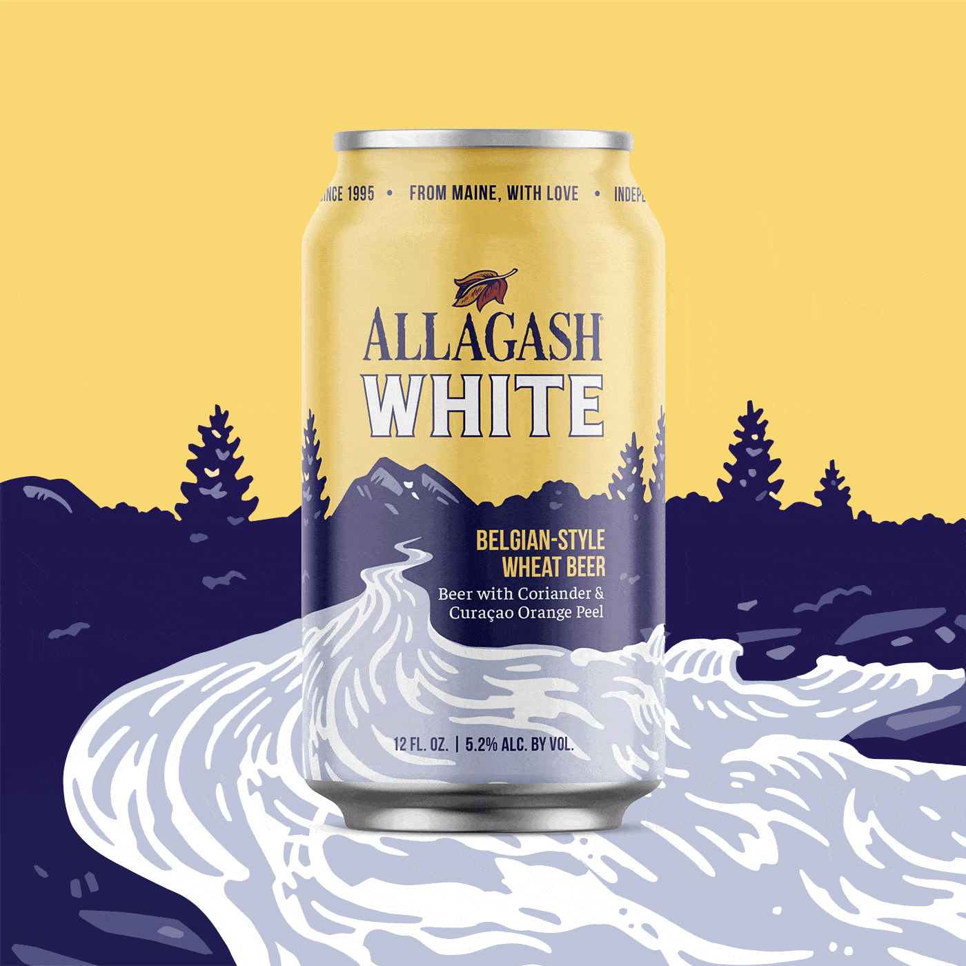
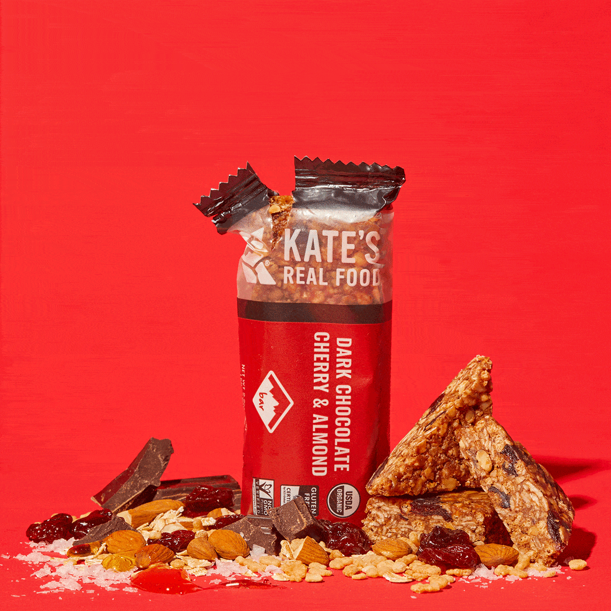
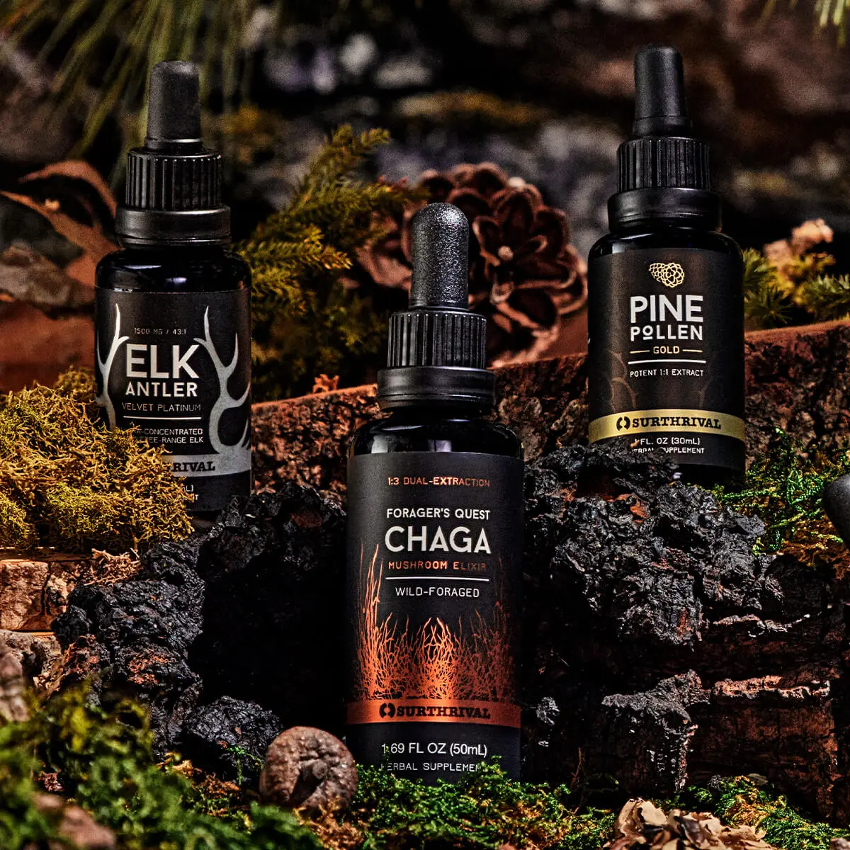
With roots firmly planted in brand strategy, we create, package, and grow emerging and legacy brands in the better-for-you, better-for-the-earth space. We call it Brand Alchemy®.


With roots firmly planted in brand strategy, we create, package, and grow emerging and legacy brands in the better-for-you, better-for-the-earth space. We call it Brand Alchemy®.