Client:
Bob’s Red Mill
Challenge
We were asked to drive creative innovation for Bob’s Red Mill by expanding its portfolio with a protein-packed powder supplement and a new grain-free baking mix line.
Deliverables
- Creative Strategy
- Packaging Creative
- Packaging Photography
Solution
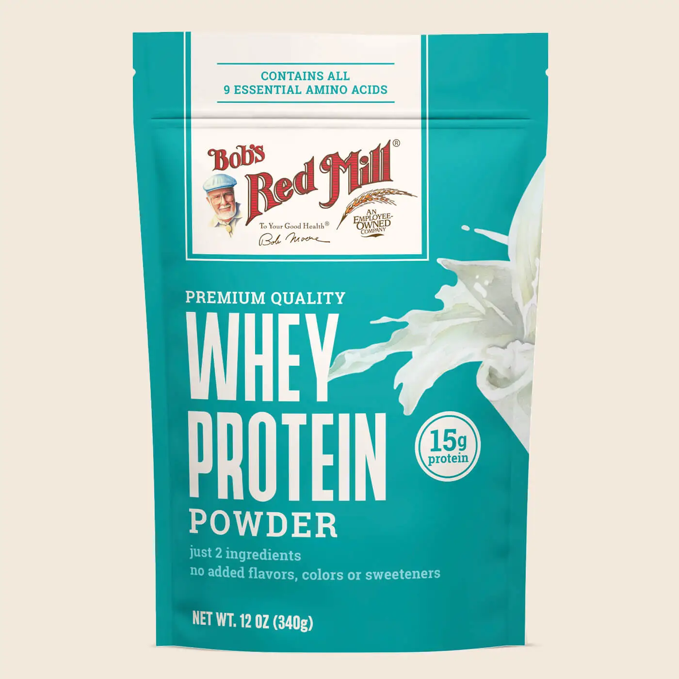
Bob’s Red Mill was after a more natural look to target the better-for-you consumer in a more meaningful way while moving the protein powder line into a store’s wellness-focused section. Therefore, we knew we needed to create a bold, clean look to stand out amongst shelf competitors while meeting consumers with easy-to-understand claims and benefits.
The protein powders feature rich colors to ground each SKU, supporting quick product identification and breaking away from a sea of white in the wellness aisle. As well as calling out key protein counts and other product features the consumer expects from a supplement, the customized illustrations were key to grabbing attention paired with the equitable brand lock-up for instant trust and recognition.
Despite being vastly different products with varying target audiences, our solution for the brand’s new grain-free baking mixes took a similar path. Bright colorways and approachable photography were brought into the creative strategy to support strong SKU differentiation and recall at shelf in order to continue pushing the iconic Bob’s Red Mill brand forward.